Introducing: Home Number Three
If you’ve been reading for a while, you may know that my little family is now living in house number three. The first was a little mid-century ranch in the the Westbury subdivision of Houston, Texas. It was a foreclosure and we did quite a bit of renovations prior to moving in. We lived there for a little over three years, decided we were moving to Connecticut, then I shared a before and after of our first home.
Next up, we owned a little Cape Cod style home. It was smaller than our previous home, but newly gutted with brand new just about everything–pipes, electric, windows, drywall. Brand new. It was small and on a small lot, but it had a really lovely view of a pond directly behind it, and I’d hop in my kayak in my backyard and row around a bit sometimes. We also had the pleasure of seeing a lot of wildlife in our backyard. It was lovely, but then came time to move, again. So, I shared a before and after of our second home and a subsequent post about maximalist decor in a small space.
Now that I’m back to blogging, I’ll introduce you to home number three.
We almost didn’t even look at this house. I’m pretty picky when it comes to aesthetics, and I really didn’t want to move from our previous house in the first place. Mark kept pointing this one out online, but we did several days of showings before I would even consider it.
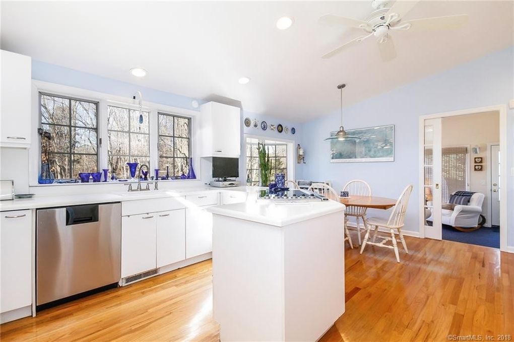
A major problem was the listing photos! Instead of the front facade as the first picture, it was this shot of the kitchen:

I kept forgetting what the outside looked like, because the other pictures on our favorites list showed the front facade, as it should. It didn’t look like a nice kitchen, so WHY?
The second shot was of the front facade, but though spring was in full effect, the picture was from the middle of winter, everything was brown and bare. Not to mention that the other homes we had been looking at had a more traditional exterior, which is what I prefer. I get REALLY cringed out when homes get too high on the McMansion scale, and that’s why I limit my interest in houses built before 1980. Plus, the first photo was a bad first impression!
I digress. One visit of the house, one feel from the vibes, and I was ready to take it on as ours. It was going to take some work to get it to my style, but I was ready for the challenge.
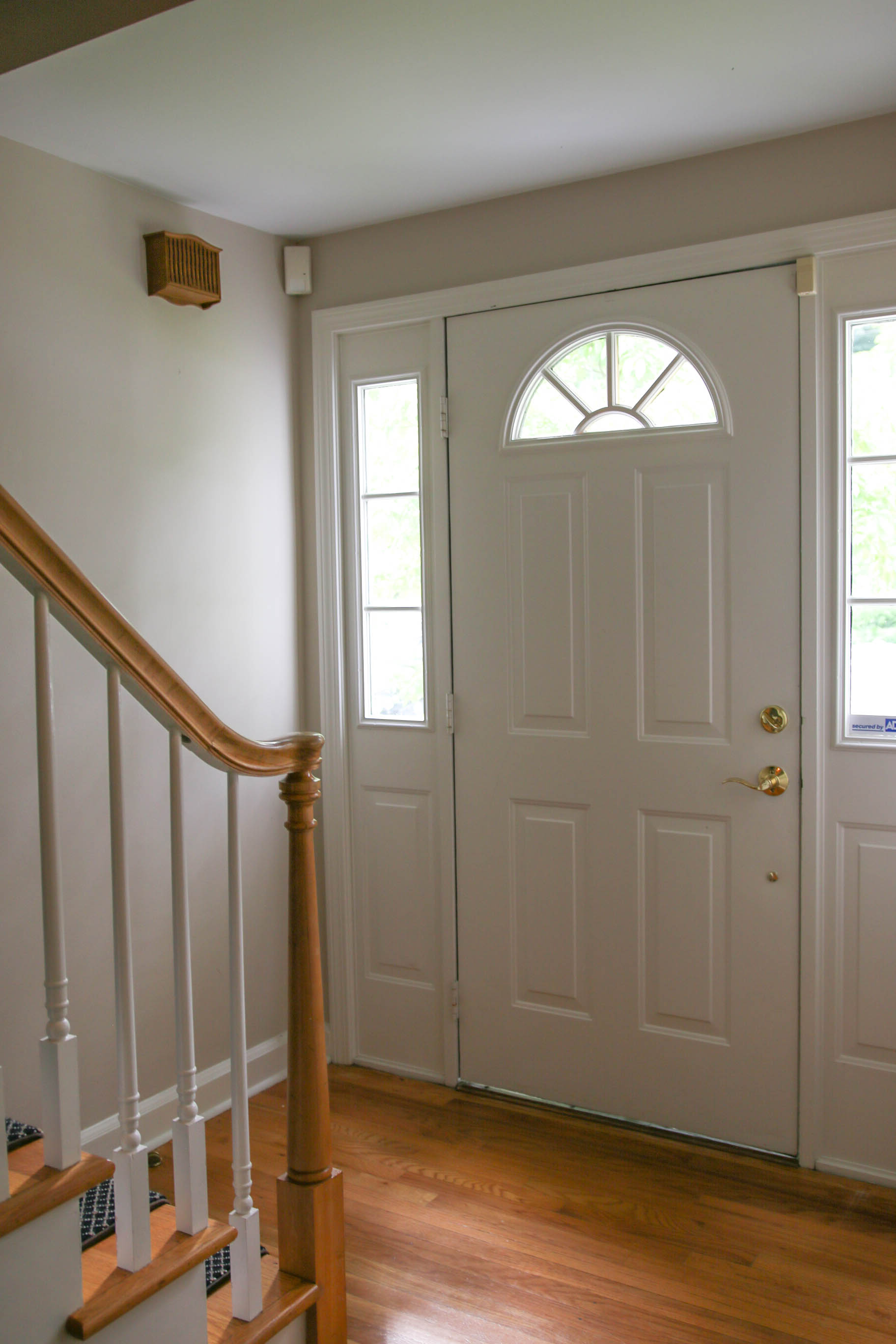
This is the front door. You step into a small foyer at the stair landing. The home is a modified Cape Cod style home–modified quite a bit–but it retains the feature of the door opening directly to the stairs, as my previous home did.
Living Room

From the entry hall (or foyer or FOY-yay or whatever you wanna call it) there’s a cased opening to the formal living room above.
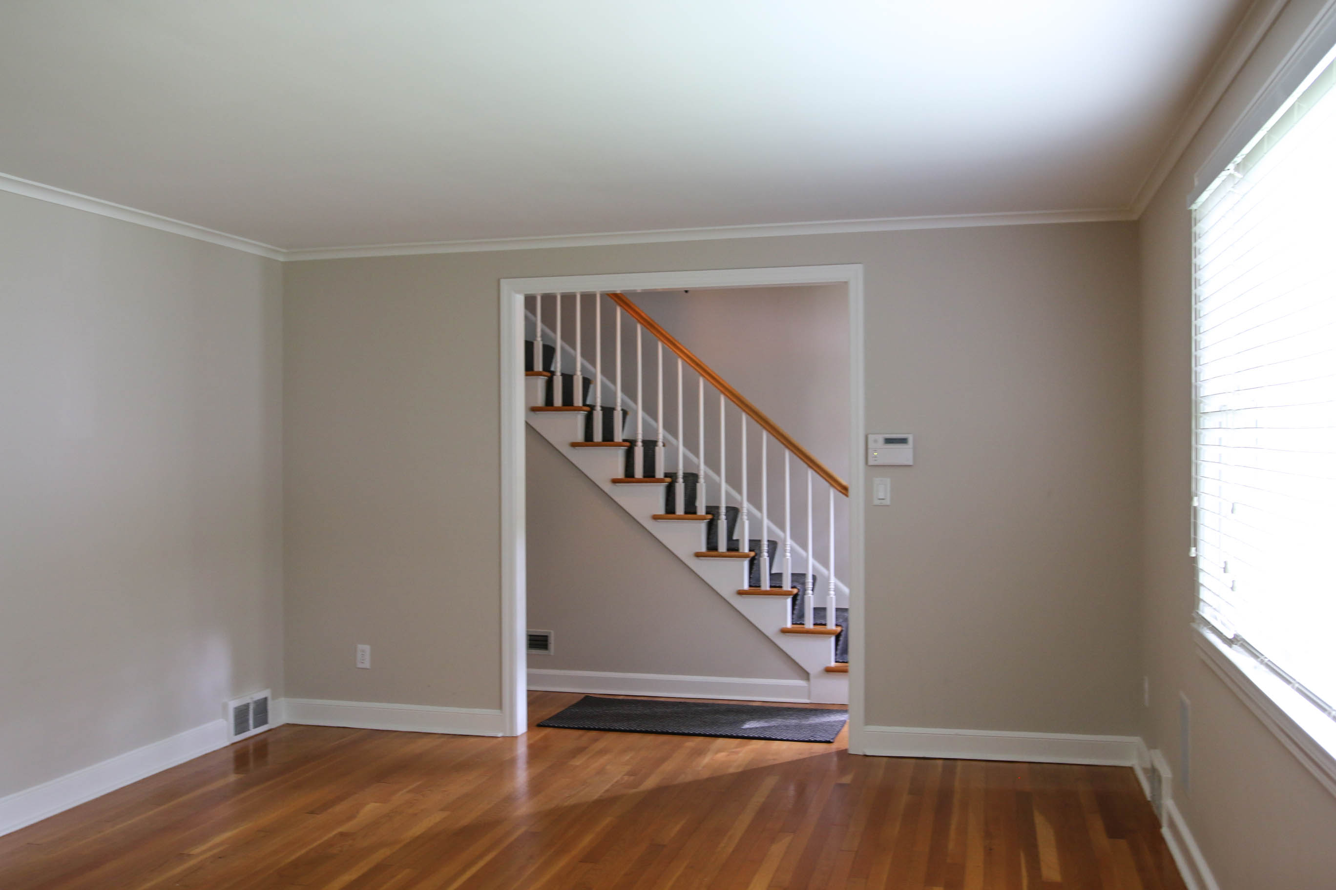
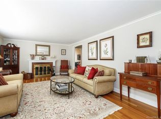
See? That’s the opening. These pictures are kind of hard to get the feeling for scale, so here’s a listing photo of this room:
I just realized, I don’t need to walk you through the same way I would have otherwise, I have a floor plan!
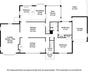
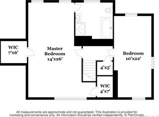 Okay, so you get the picture.
Dining Room
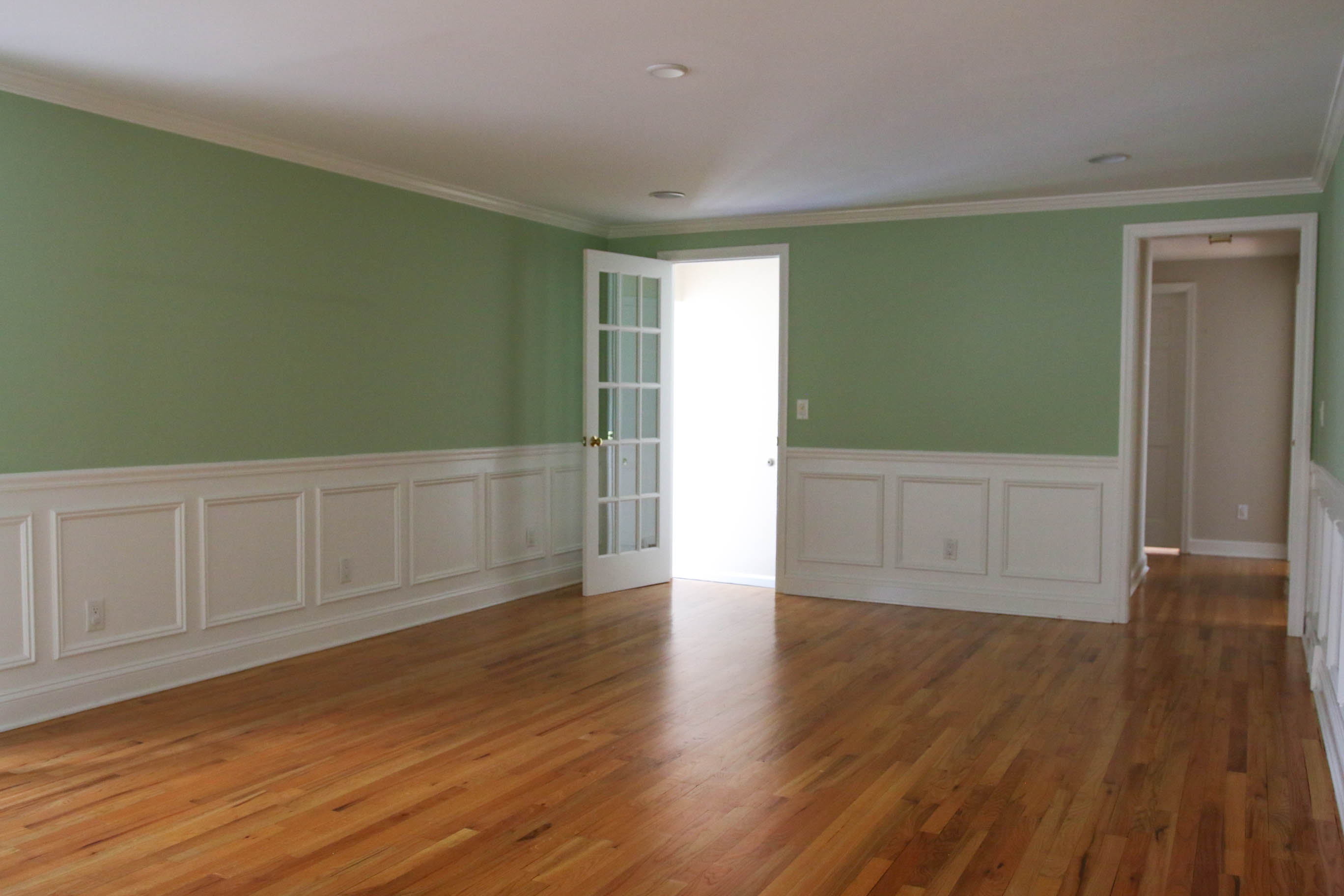
The listing called the dining room “banquet sized. Here, it has the previous owner’s furniture for scale:
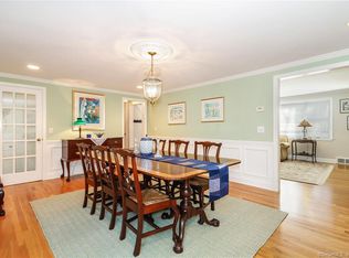
It looks bright in that picture, but that’s editing. This room doesn’t have any windows, so even with the recessed lighting it had, it was still very dark.
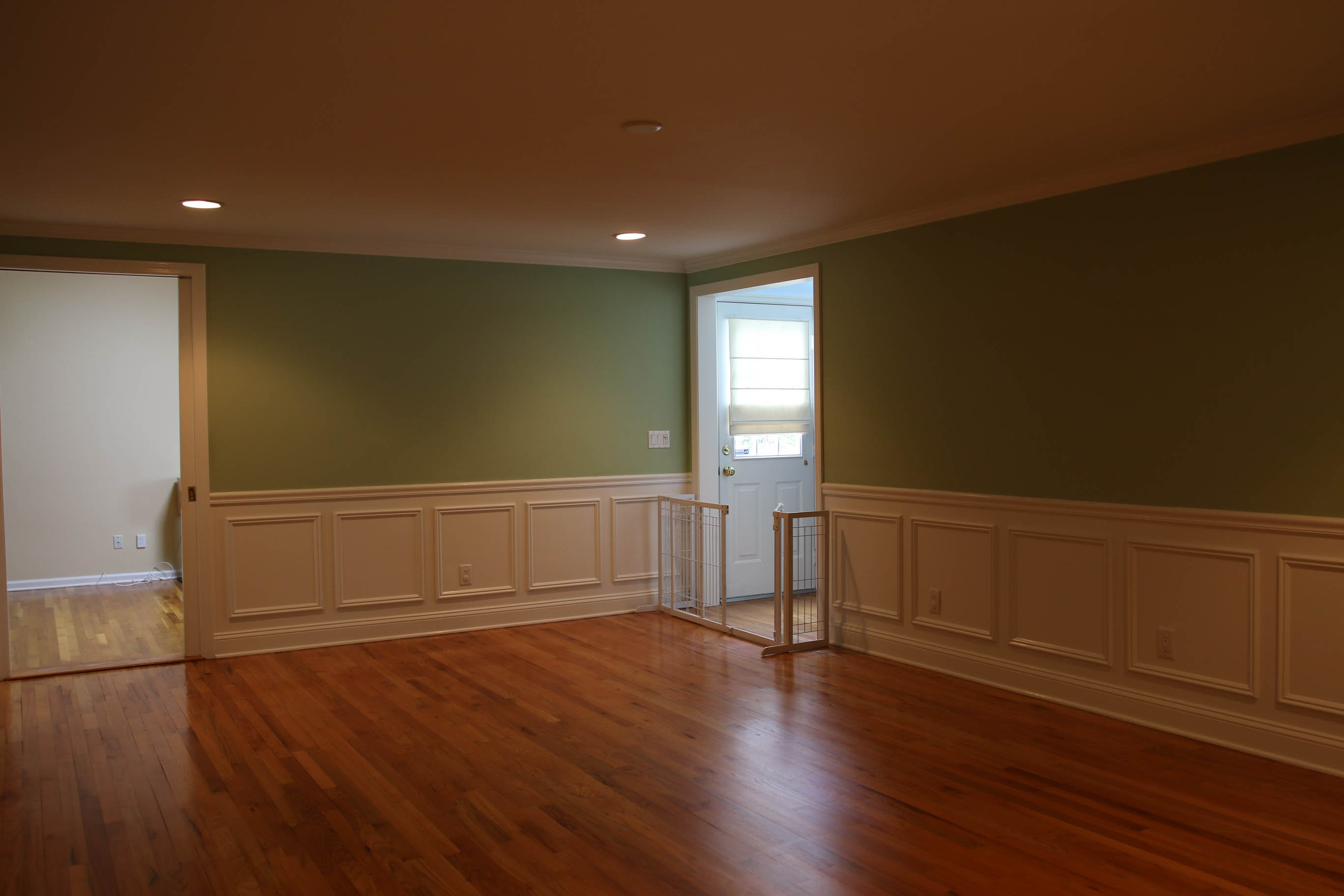
Playroom
The dining room has a Sliding French door that leads to the playroom. Though the home was originally built in 1951, the playroom was a later addition.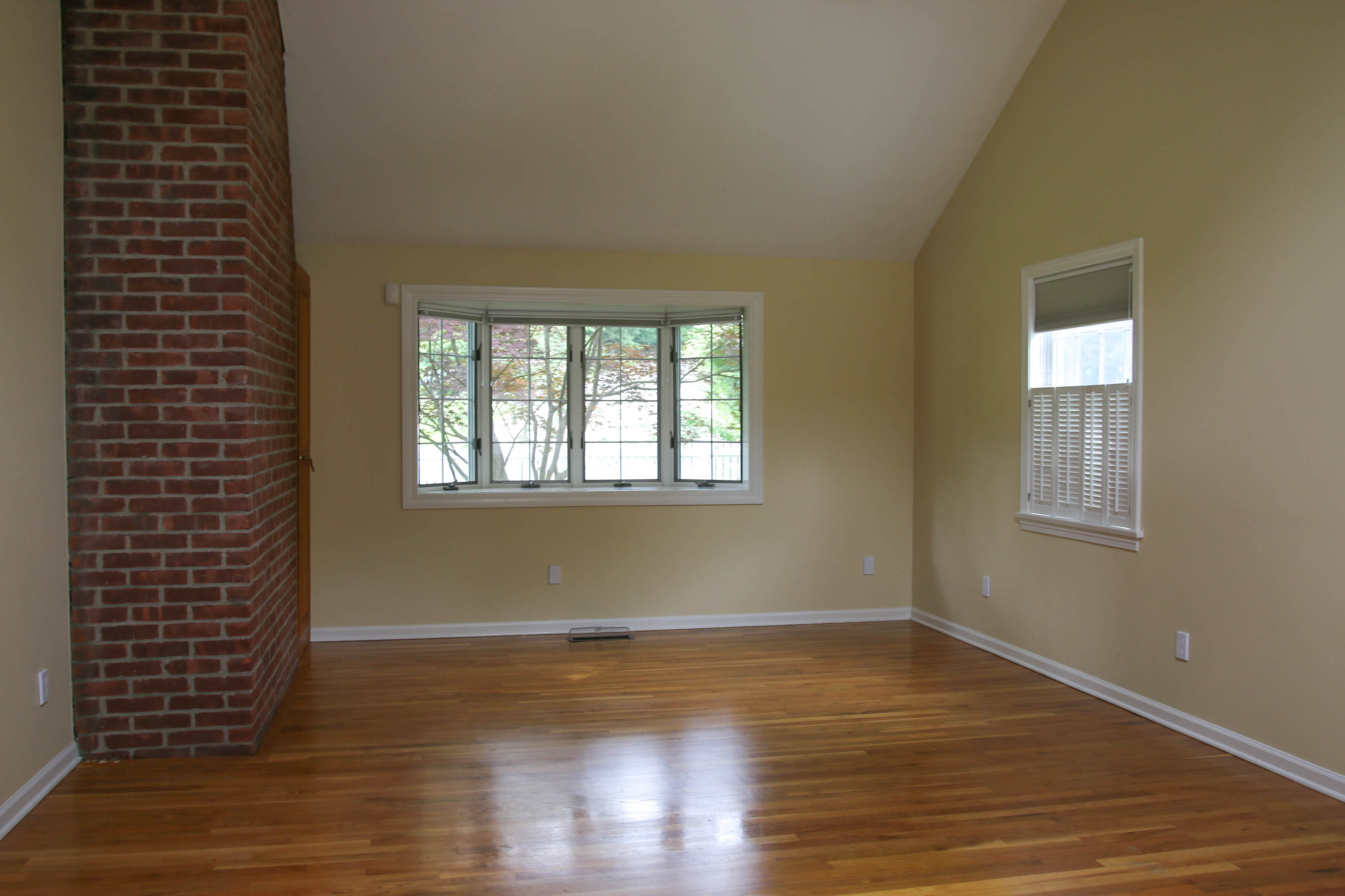
Its a very large room, as you can see from the floor plan above. Here’s Mark for scale:
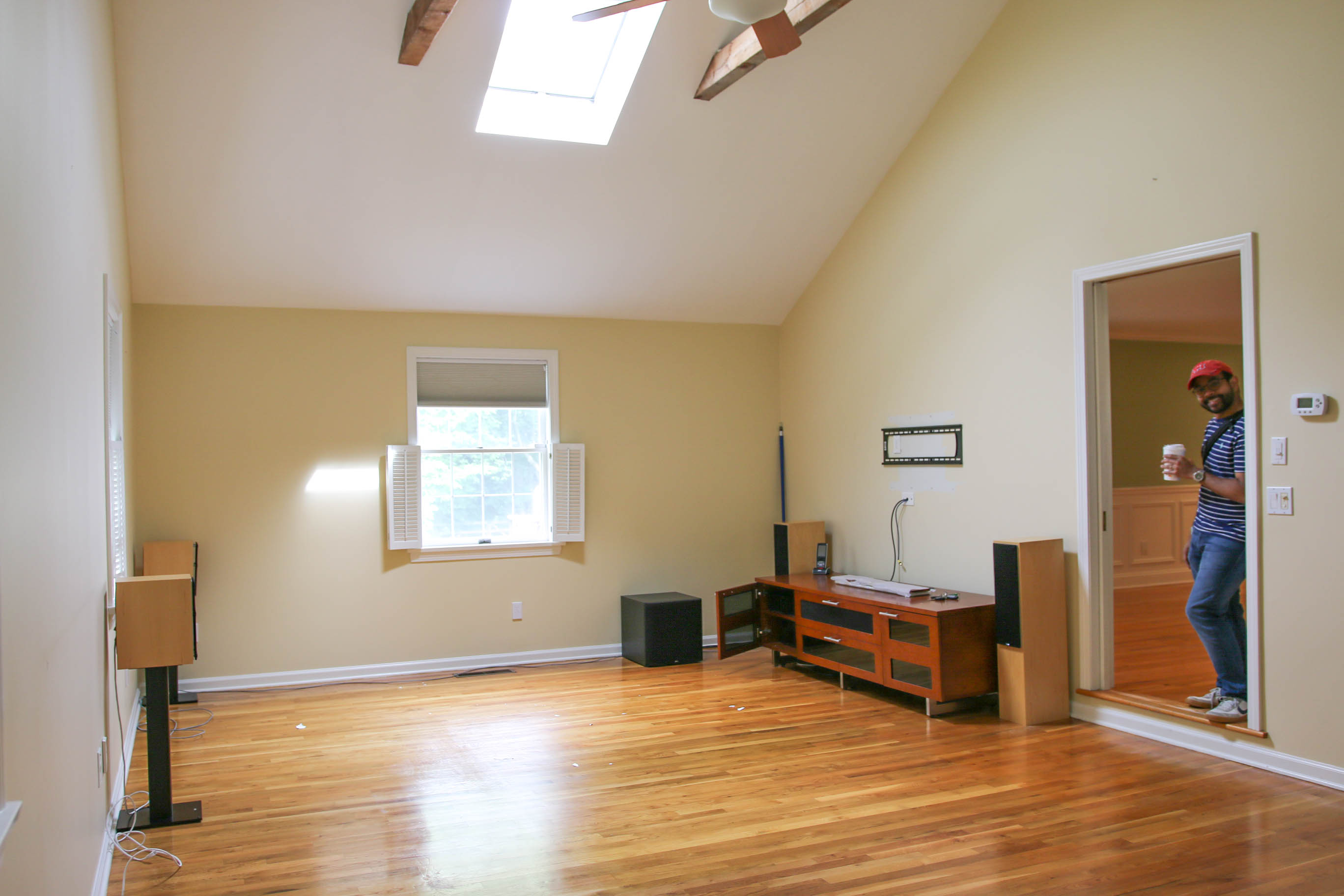
😁 That furniture was left behind by the previous owner. They had a surround sound stereo system that was also hooked up to recessed built-in wall speakers throughout the communal areas. The TV stand they left behind houses that hardware.
Kitchen
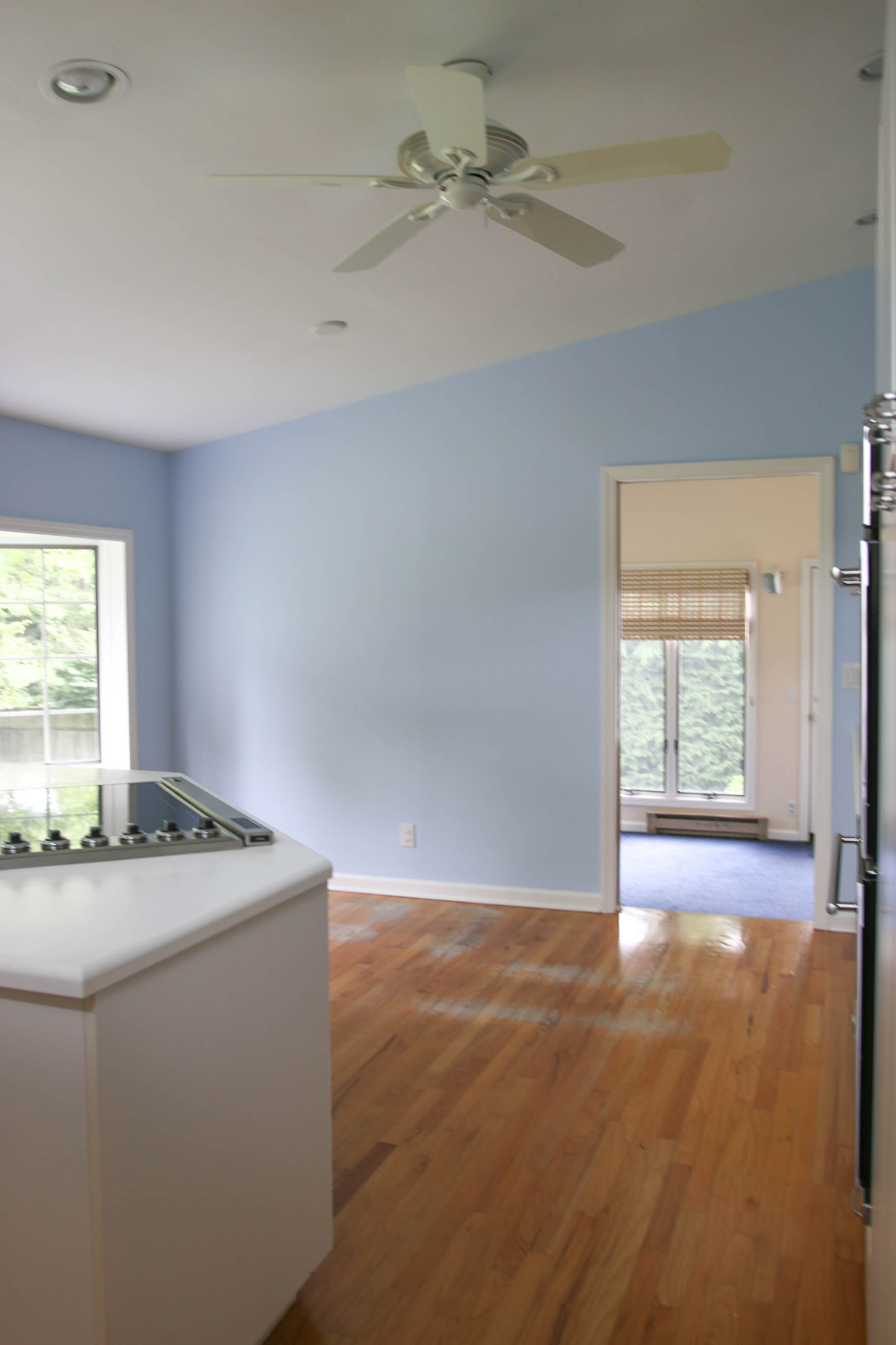
A different doorway from the dining room leads to the kitchen Once all of the previous owner’s things were out of the room, but before we moved in, it looked like this:
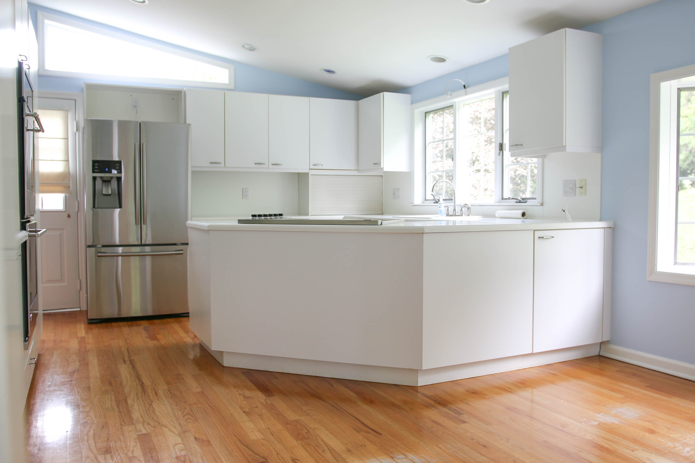
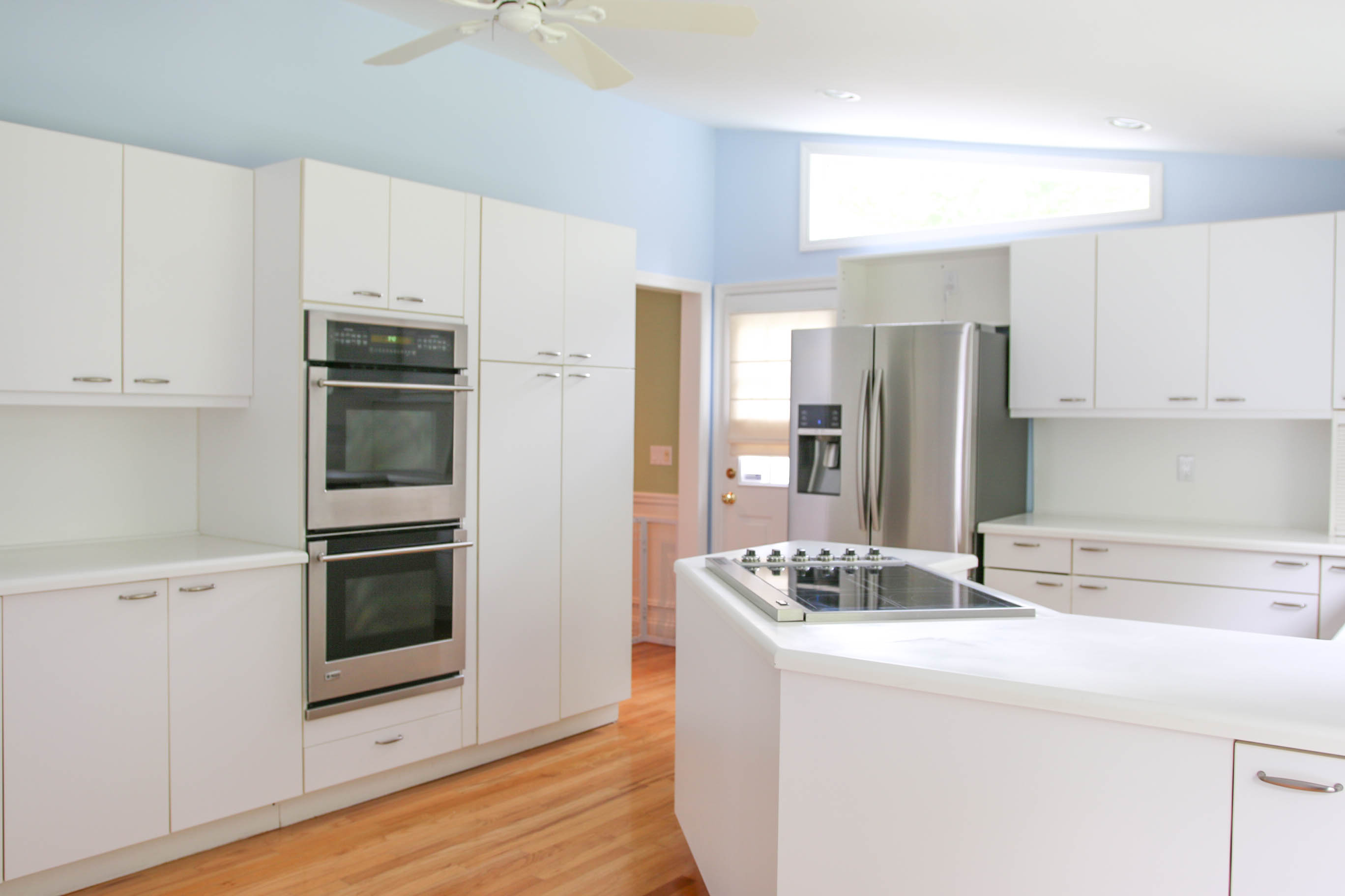
It has a great little breakfast nook, where we share nearly all of our meals.

Sunroom
The doorway seen in that last picture has another French pocket door and leads to the sunroom. I didn’t come across a picture taken of it that day (I was running around trying to get all these pictures taken, as our next stop was to head to the lawyer and sign the last of the paperwork making it ours.) Here’s another listing photo in its place:
First Floor Bedroom 1
Referencing the floor plan above, this is the bigger bedroom on the first floor.
The only lighting in here was that boob light. It was really dim.
First Floor Bedroom 2
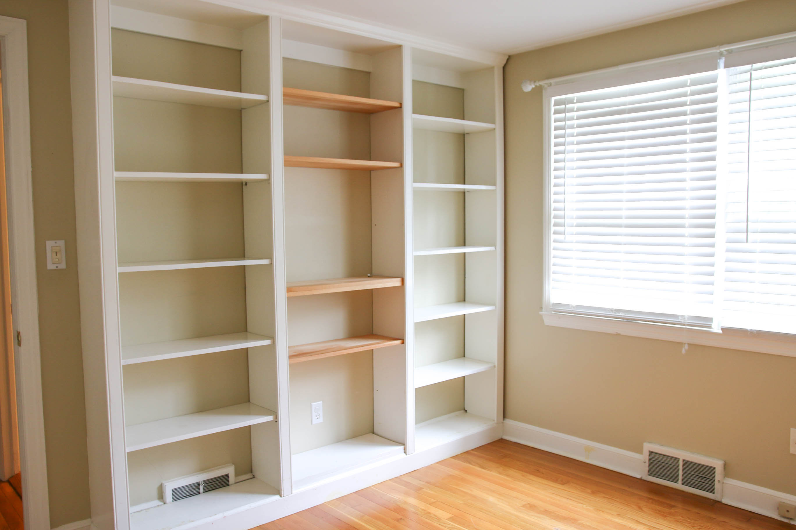
The previous owners used this as an office, so it has some great built-in shelving.
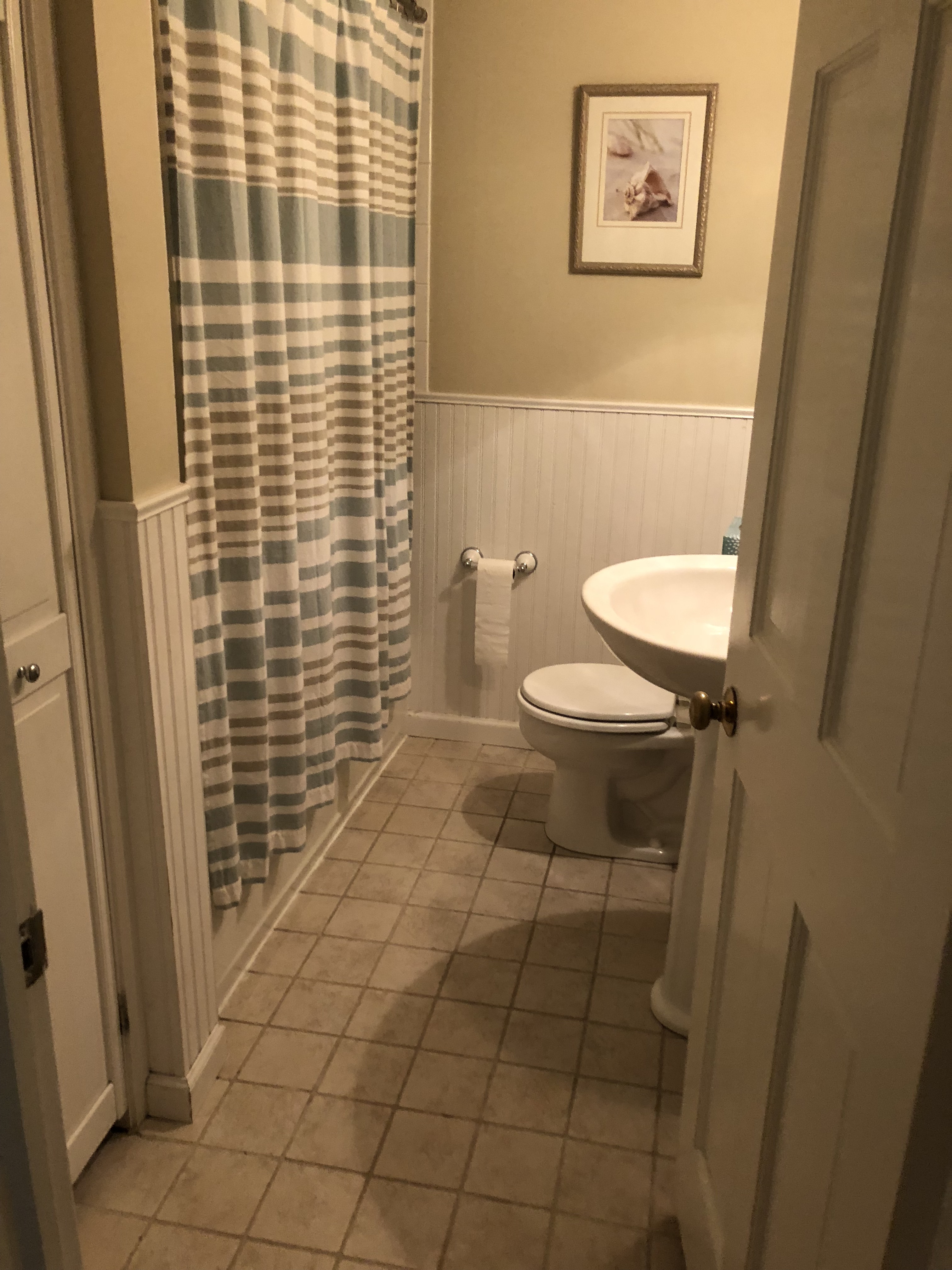
First Floor Bathroom
Didn’t get a picture of this on contract day! But I did when we had our second showing while we were under contract.
Master Bedroom
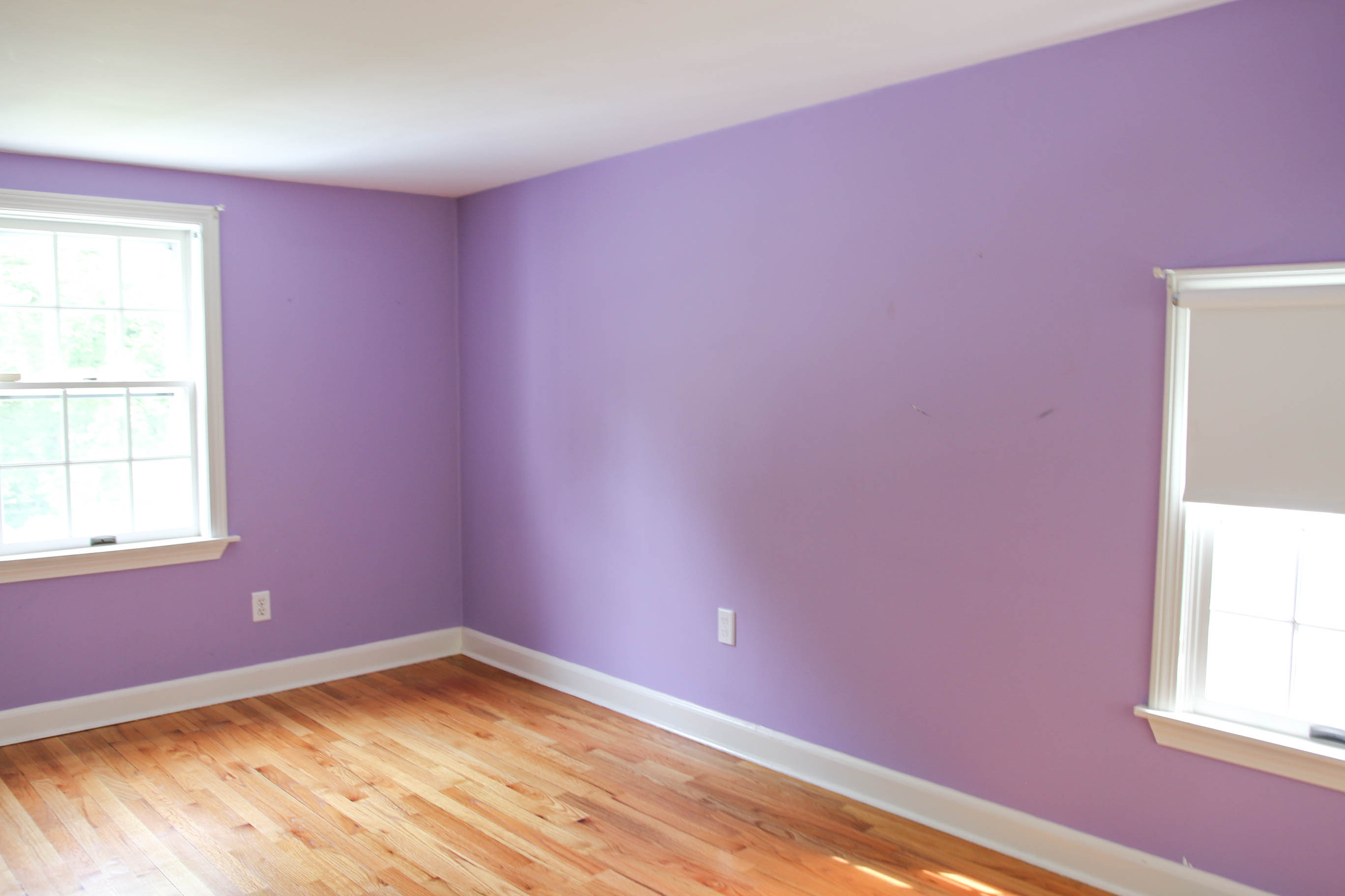
As you can see from the floor plan, our master bedroom is huge! This was a huge drawback for me. I just spent a couple of years going on about how great living small was, and now I was going to have all this unnecessary space??
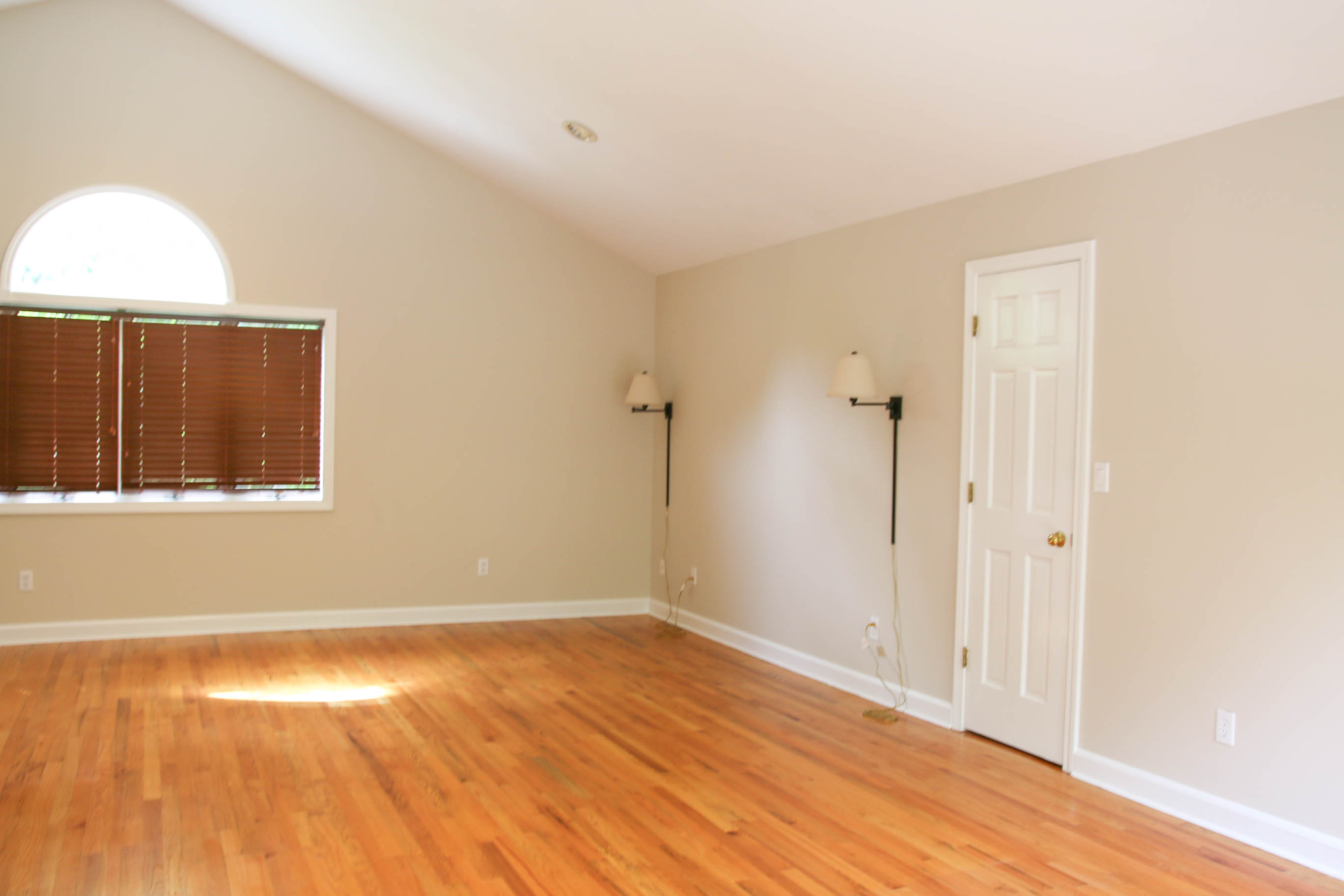
Maybe, is we stay here long enough (with our past, who knows?) we’ll make adjustments for a better use of the square footage.
Again, for better perspective of scale, here’s a listing photo:
Master Bathroom
Not gonna lie, the master bath was pretty hideous.
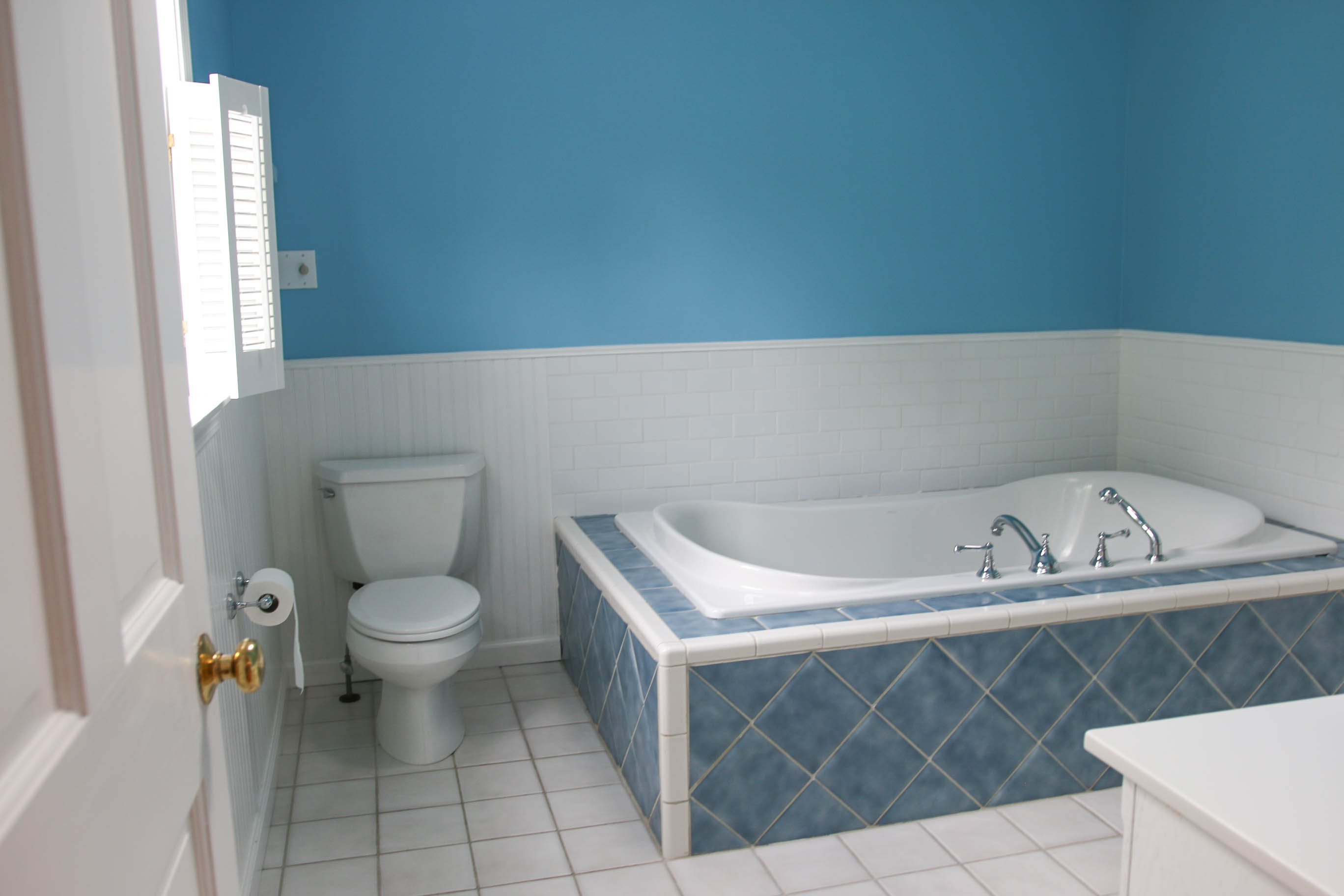
Ok, ok. It’s still kinda hideous with a new coat of paint and a different light fixture. No one really sees it but Mark and I, anyway.
Fourth Bedroom
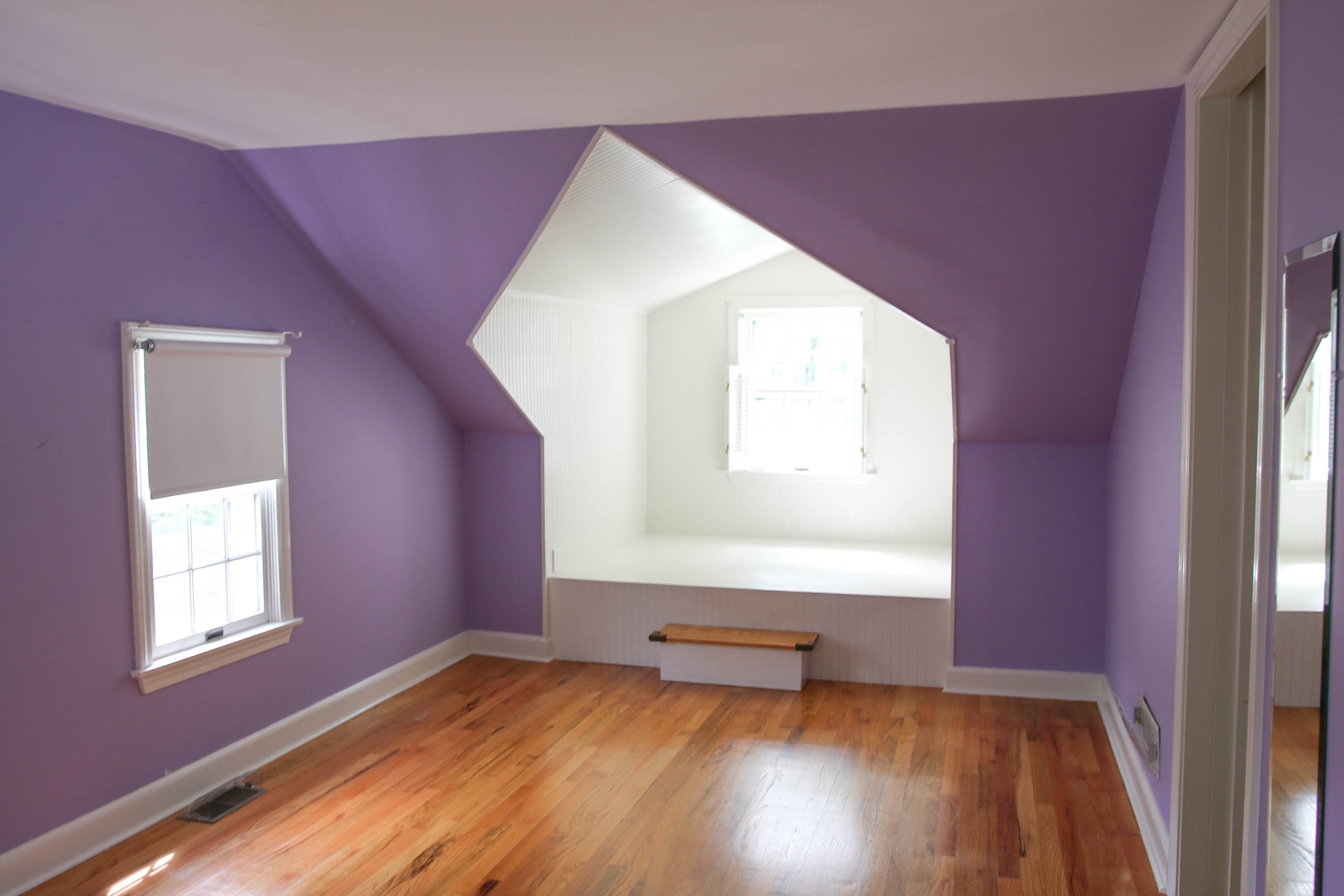
This bedroom is super neat because it has this sweet little headboard alcove that can be used as a reading nook. What bibliophile hasn’t dreamed of a reading nook?
Backyard
I almost forgot the best part! What changed my mind from my initial impression of the home was the property that it sits on.
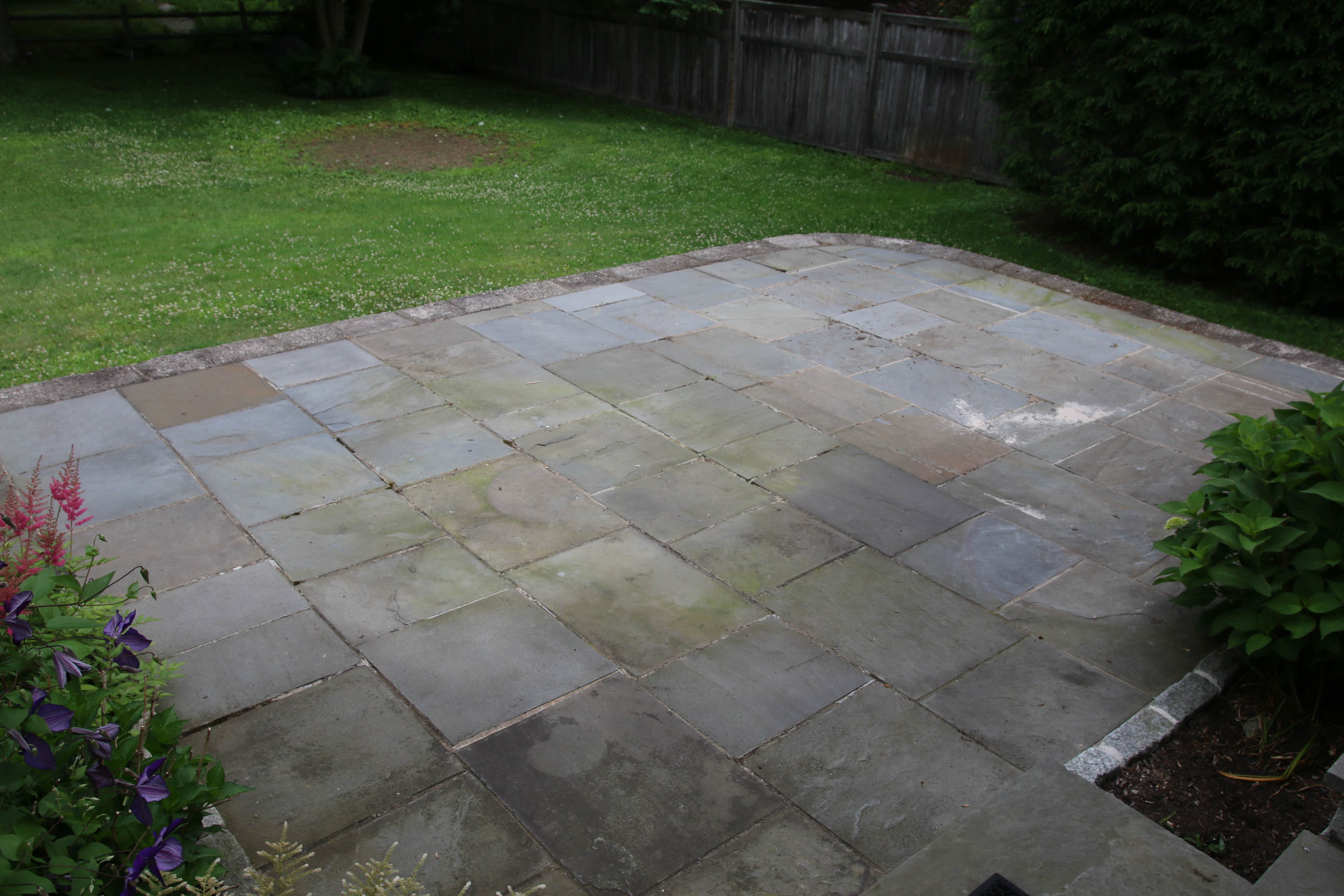
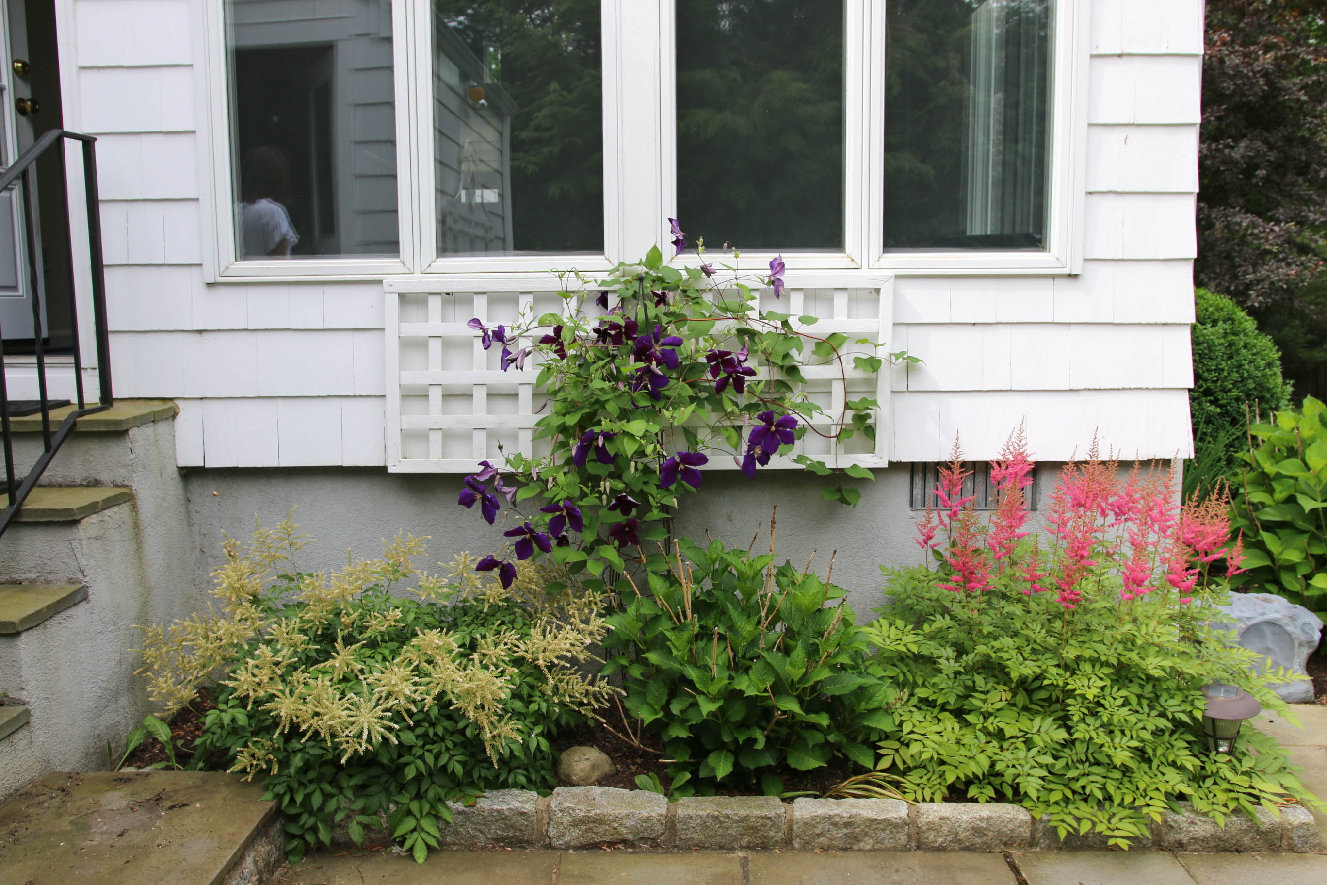 When you exit the house from the sunroom, there’s this little garden and a flagstone patio.
There’s also a fenced stream with a bridge going across it on the property. A very good-sized yard.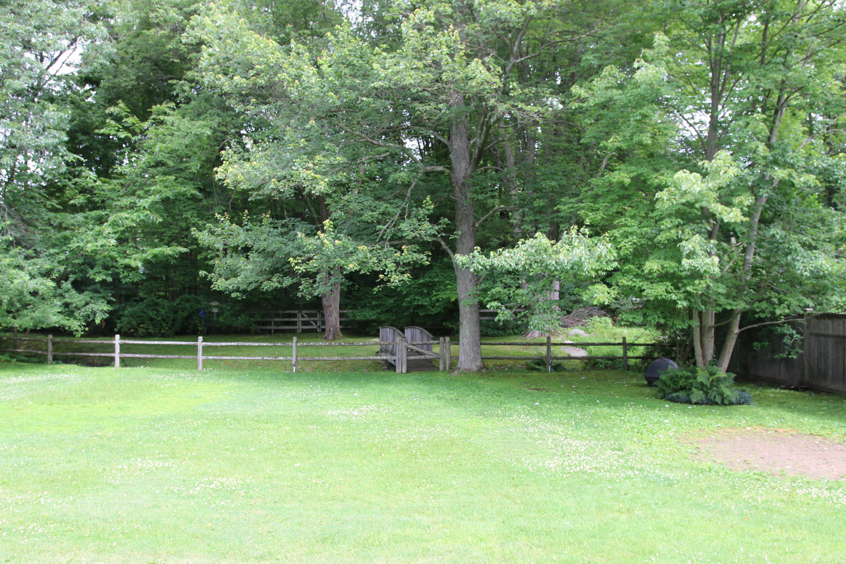 And a great playset for the boys! I pictured the kids having friends over, running through the yard and being able to see them from the kitchen and sunroom, then i was sold. I love the idea of the kids exploring the little brook and having the forest right behind us.
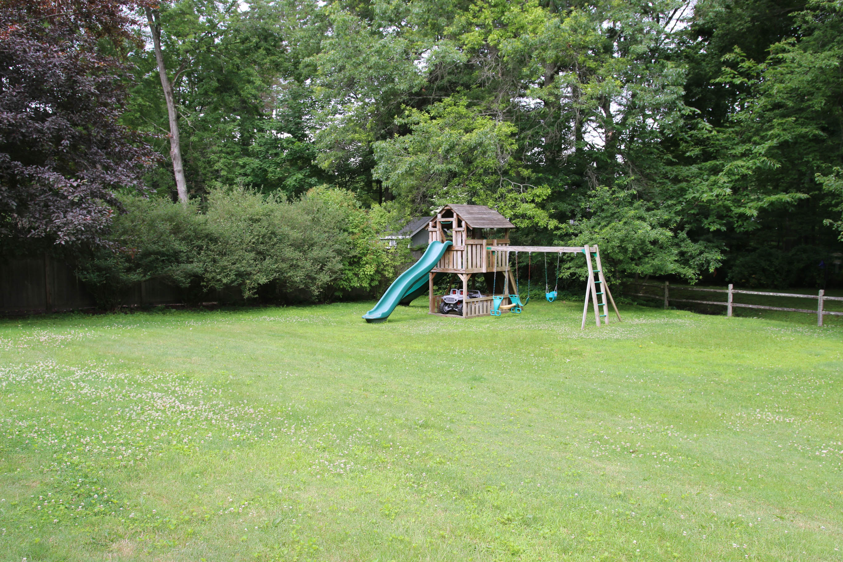
Here are pictures from the listing, from winter, of the back of the house:
That’s all, folks
This concludes the before tour! As you can see, I had quite a lot of work ahead of me. Most of which I’ve done between baby snuggles 😍🥰🥰
[…] you know, we moved to our new house recently. What you may NOT know is that we moved in exactly three weeks before I gave […]
[…] sugar cookie (gingerbread alternative) replica of my house. My old house, that is. The façade of our home is more complicated and I didn’t have any grand plans of making a replica of it this year. But […]
[…] I mentioned in my years-old introduction to this house, the real estate listing touted this space as a “banquet-sized” dining room. That sounded […]
[…] some leftover paint from previous owners of our home, leftover wallpaper from our dining room, and some tips from Brenda Cooper’s book, The Silhouette […]
[…] they were installed in the office at our current home, it took me four years to hem them to the desired length. Give me a break–my youngest child […]
[…] my teeny tiny baby on the left? I forgot my studio used to look like this. We had only moved in to our home eleven weeks […]